PROCESS: Spring Surprise illustration
PURPOSE of this PROJECT

This post is all about the process of creating “Spring Surprise”, an illustration I completed for my portfolio. Enjoy!
This illustration would hopefully be a portfolio piece. An illustration with warm, light spring time colors and a spring theme seemed like the best addition to my existing body of work.
At the time of doing this drawing, I was 3 weeks away from having a new baby! Since it’s impossible to predict how those first weeks will go, I wanted to have something that would seem timely when I was ready to get rolling again in early April.
We live in the age of social media* and it’s important to WORK AHEAD. I started The Elves 2 weeks before Christmas. By the time I got my character designs and story skeleton worked out, it was already New Year’s! I have no regrets about the timing of that project but I wanted my next project to be something I could release on social that felt of the moment. Now I’ve got an Easter illustration all queued up that I’m quite proud of.
After mulling this compilation over I noticed the following:
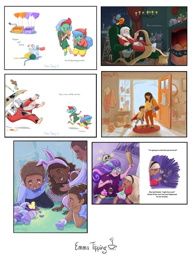
All of my pieces feature an adult and child.
In most of the pieces the characters are standing upright.
2 out of 3 of the full bleed pieces (full color reaching to edge of pages) are cold month color palettes (winter and spring).
All of these illustrations are zoomed out on a scene. Gretel and the Witch has the biggest close up and even that is still fairly zoomed out.
None of the illustrations have more than 3 characters.
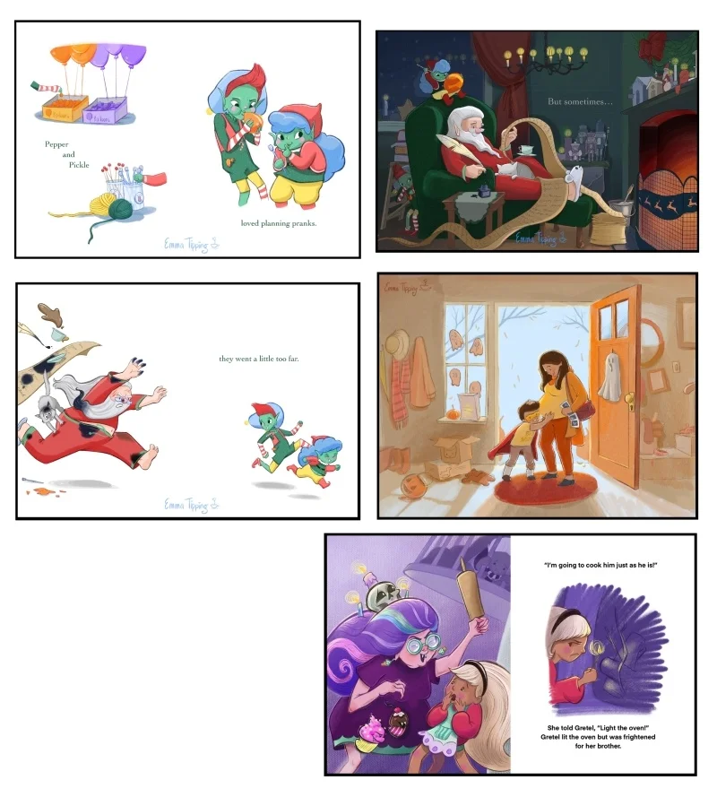
FIRST SKETCHES

Add to this that I had budgeted just 5 days to finish this illustration. On some of those days I’d be cramming in only 1-2 hours of drawing in the evenings. I did not feel like I had the time to properly research and plan a dinosaur drawing that would do itself and its kid viewers justice. Introducing a dinosaur also brought with it a litany of story telling opportunities that I would feel remiss to just neglect. A baby chick would be a simpler narrative. Furthermore, I was planning to do a group of kids with darker complexions and thought that the combo of pastel yellow chick, yellow green grass and pastel easter eggs would look really nice against the neutral, dark reds and yellows of darker skin tones. So the cousin-to-cousin shift from dinosaur to chick was made, with the hatching dino/ Easter egg concept put optimistically into my “Ideas for Later” pile.
Creating these quick thumbnail sketches is one of my favorite parts of illustrating. It’s such a free part of the process where all things are possible. For Spring Surprise, I especially loved drawing the chick’s silhouette and sweet little beak!
COLOR CONCEPTS
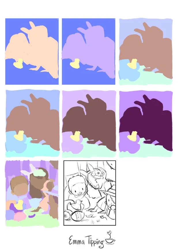

As you can see, I played with having the same color family in the foreground and background as well as using the kids as a “split” between two different colors. My goal with this concept phase was to explore the following:
How to make the chick the focal point of my illustration using color. I planned to do this by contrasting the yellow chick with an intense purple or blue violet, as well as having a stark value contrast in the same spot that I would work out in the value stage.
How to create a spring-like palette that stuck mostly to vivid, pure, pastel colors.
LINE

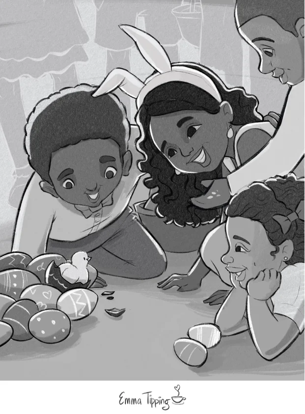
Finally, it was time for a value study! While value studies are time consuming and finicky, I’ve come to really love and depend upon this part of the process. If I get the values right and have a rough color palette, then the final color stage comes together pretty easily. As usual, I’d be using this stage to figure out lighting, the values of different elements, creating a balanced composition and establishing a clear focal point. Sadly, to free up space on my iPad I erased all my other value studies before writing this post (doh!) but here is the value study I decided to go with:

I really liked how the lighter lines in the background gave the piece a woodblock feel. It also helped keep the viewer focused on the main action in the foreground. I’m not sure if I would do disembodied legs in the background again but at the time they felt like a good device to convey a crowd while focusing on the kids in the front.
I ran this version by my editor (again, the nine year-old girl who lives with me and calls me “mom”) and she loved it!

…and it looked good! So I edited my line drawing and then my value study to include his new head pose.
Last but not least, you can see that in the line drawing above, the eyes of the girl in the middle are different from the value study. That’s because, you guessed it, I realized that she was gazing off into the great beyond as well. Finally, after that adjustment, I was ready to start adding color.
FINAL COLOR
I was so close to being done but the girl with the long hair was still catching my eye too much. I decided that the multiple value contrasts of her eye whites to irises and hair to highlight were just too eye catching. I toned both of those contrasts down and here is the end result!


And here is how it looks in my portfolio!
Spring Surprise was a lot of fun to create. I’m happy with how it looks in my portfolio and also happy to have solved a number of problems. Best of all, I’m super pumped to move onto the next piece, apply what I learned during this process, and tackle some new challenges.