Inventing cute fairies!

One of the best parts of illustration is designing new characters for a given story. Are you writing a good old fashioned buddy drama set on top of an ice cream cone? Ok well how about a cadre of sprinkles who are always in competition to be the brightest yet routinely have to band together to avoid being eaten?! Or how about a modern take on Hansel and Gretel? What does the witch look like in the current candy landscape with snickers, m&m’s, swedish fish and pop rocks all at her disposal?
Illustrating Autumn Fairies was no exception. If you haven’t read about my artistic adventure with this super cute poem by Sarah Meade you can read more here. Or stick around on this page and hear all about how I created these fantastical little graffiti artists.
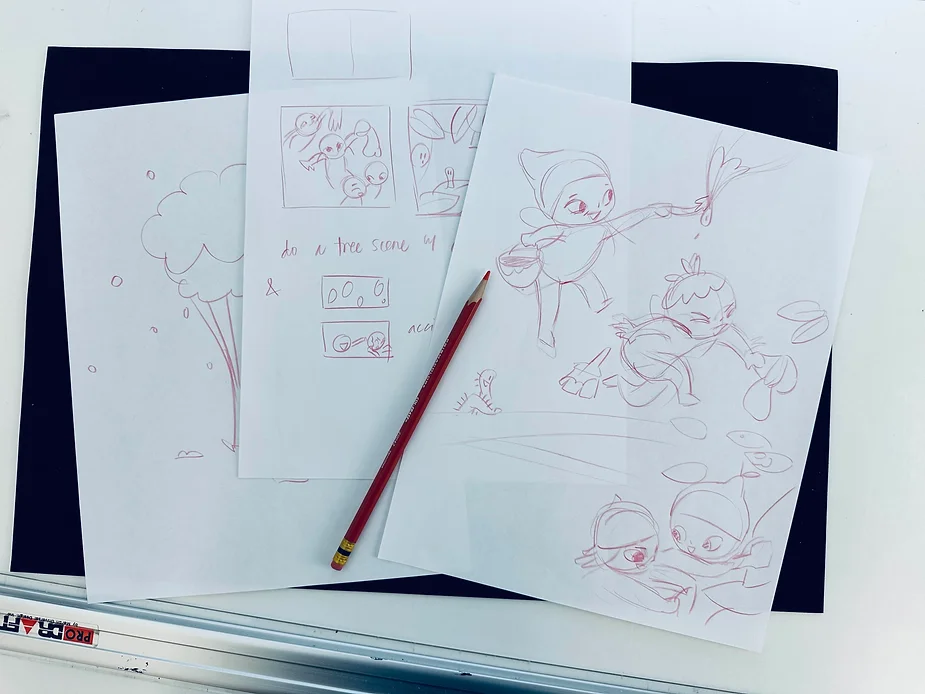
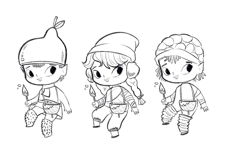
Some sketches as I figured out how my fairies would look and interact.

You might say that fairies are in my blood. I grew up listening to fanciful stories spun by my English grandmother, a lively lady with a wild imagination and deep story-telling roots. When I wasn’t hearing tales about the pixies in the trees or the mermaids in the River Mersey, I was usually curled up reading Mr. Pink Whistle by Enid Blyton or Elfquest by Wendy and Richard Pini. Fairies have been stewing and percolating within me since my earliest memories and I could not wait to create some new creatures to illustrate Sarah Meade’s poem.
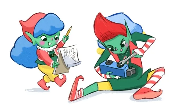
Some of my character designs for Pickle & Pepper, Santa’s most pesky elves!
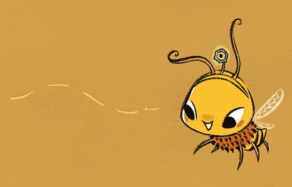
Character design for my favorite adventuring honey bee, Princess Honey.
I figured I’d go with a similar style treatment for Autumn Fairies. After all, what’s a fairy if not a mash up between an elf and a honey bee? It was nice to be able to draw on that hard work I had already done. Kind of like dipping into the freezer to find a morsel of dessert only to realize that I had a whole pie laid away from the last cherry season! Thanks, me!
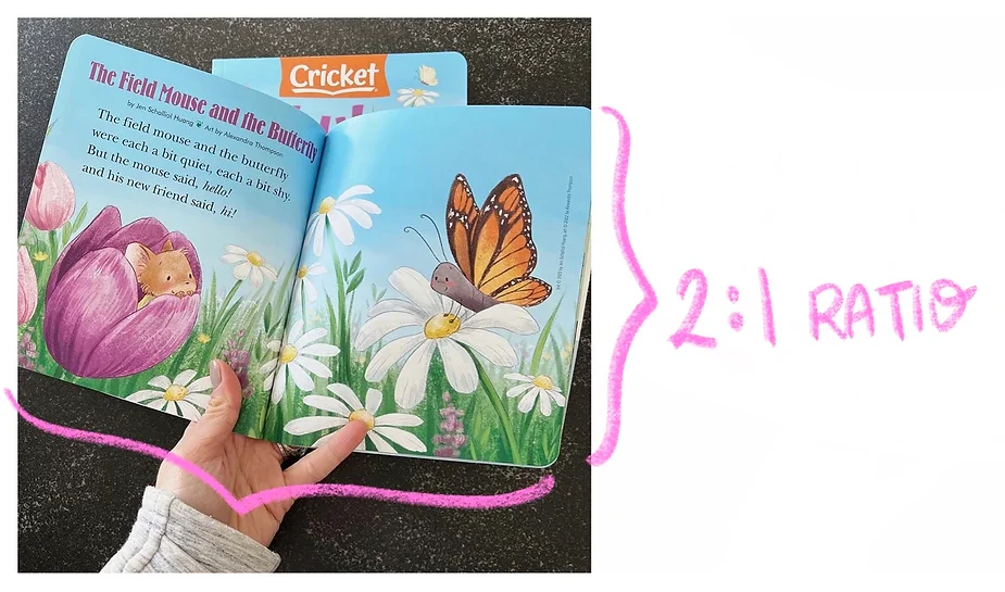
Without much trouble I decided that doing a sample spread for Babybug magazine by Cricket would be ideal. This meant I would be designing for a 2:1 ratio spread. I’ll translate this in case art speak sounds like gobbledegook to you. Basically, every page is exactly as tall as it is wide, and when 2 pages are laid side by side (as in when the magazine is opened on a cute baby’s chubby legs) it is twice as wide as it is tall. You can see that here, in this image of Alexandra Thompson‘s extra adorable illustration for Babybug’s spring cover:
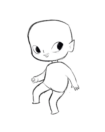
I planned to create a spread of images that would be compatible with Babybug’s format while also fitting in more than 1 large image. Having a cast of different bodies shapes might end up being a bit cluttered considering my space constraints so I decided to stick with one basic body shape that was appealing, whimsical and very cute. Here was the basic figure that I came up with:
Et viola!

I love thinking about where characters live and how the natural resources and material culture of their world impact their appearance and behaviors. These elves, I felt, as the critters who paint the leaves new colors in autumn, must be steeped in nature. They are almost like little gods who bring about vast, intrinsic change ever though they are very small. I dressed them in natural materials like grasses, furs and leaves with raspberry and pear hats making cameo appearances.
Here is a close up of the acorn top paint pails and a square brush.
Of course, our autumn fairies needed their art materials. As an artist myself (in case you didn’t know that by now), I have spent a lot of time studying different art materials. This was not a project where I wanted to spend too much time coming up with complicated paint brushes etc. After all, I wanted the characters to be simple so they would read quickly and cleanly in the small format of Babybug magazine. I did enjoy a certain satisfaction however in giving them little acorn top paint pails and simple handmade brushes with wooden handles. You can see in the above that I just put the same pail and brush on every fairy to keep things simple. In the final artwork however, I added some big, square brushes as well.
Last but not least, it was time to add some color. There were 3 major considerations for color in this project:
TIME. I’ve been building out my color palettes in Procreate over the last few years as a tool for minimizing how much time I have to put into figuring out color for these smaller projects. I was pumped to use one of those palettes and see how it translated from one project to the next. You might also call this “efficiency”, but that’s a clunkier word to use in a list!
THEME. This is a poem about autumn! Time to break out those gorgeous, autumn colors!
LOCATION. My fairies are little nature lovers. They don’t have access to all the vivid colors that are produced by synthetic chemical processes. Any vivid colors will occur by natural causes, whether it be in their own pigmentation or in the environment around them.
I also nursed a desire, quite briefly, to have Princess Honey make a cameo in my Autumn Fairies illustration but I ended up removing her in favor of more generic woodland critters so that the fairies could be the main characters. That was a big factor that lead me down the path of using this palette.
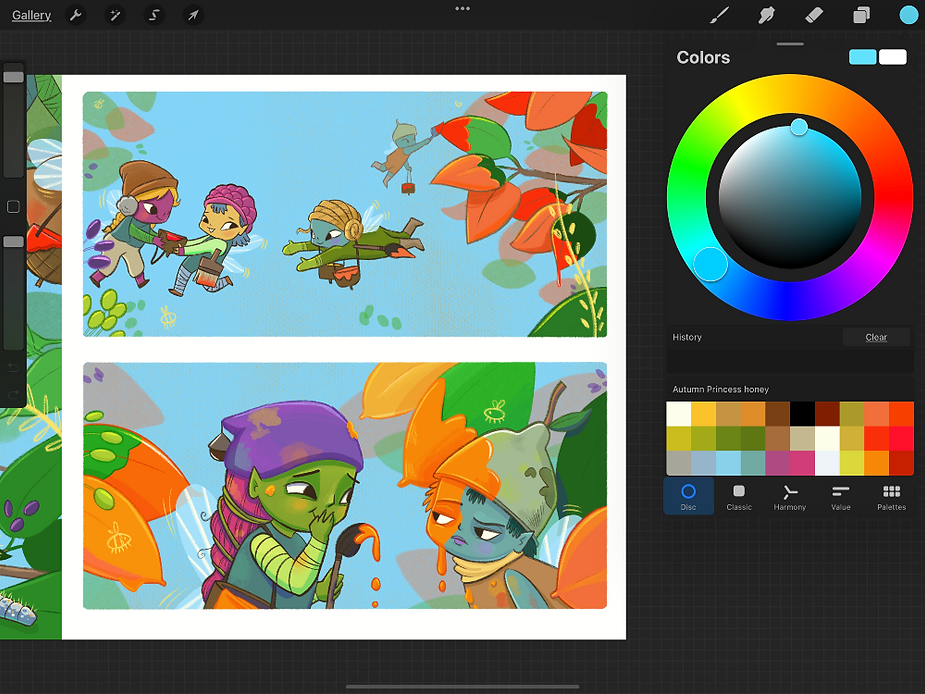
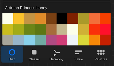
My Princess Honey color palette in action. The custom palette feature in Procreate is AWESOME.
The finishing touch was to add color to my fairies’ paint brushes and acorn top paint pails. Once those colors were plopped in I went back and re-jiggered the fairies’ skin, hair and clothing colors so that they complimented their particular paint pail.


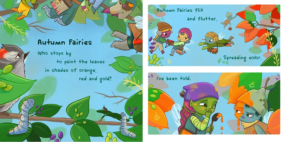
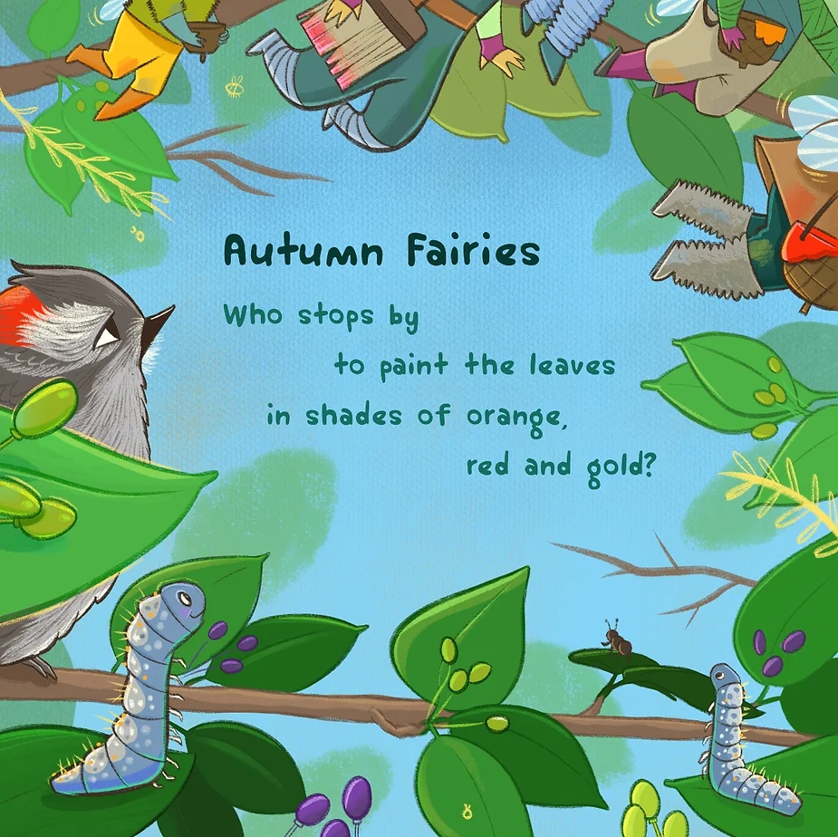
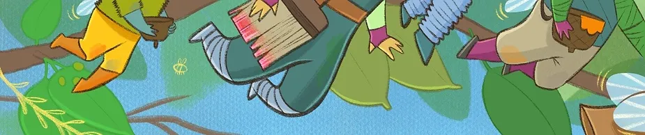
My autumn fairies in the final spread, up to their annual graffiti!
And here is the end result! I came up with 3 designs that I leaned on to create the crew of graffiti artists featured in my final illustration: