Building a working watercolor palette
Hankering for some fun detective work? Start investigating the color palettes of your favorite artists! Whistler was famous for his use of limited pigments; the impressionists revolutionized how light was painted using the newly discovered cadmium line; Iraville mixes and preps colors for her own palette, building neutral colors like Sap Green and Sienna Yellow into a lush and soothing symphony; and don’t even get me started on Mimi Robinson‘s gorgeous harmonic choices. There is no end to what this sleuthing will uncover!
Artists come up with their own palettes for all kinds of reasons and as I began dabbling in watercolor those reasons became my own. Here were the 4 big ones:
1) Cost. Paint and colored pencils are expensive and unless I wanted to functionally donate my life savings to Lenz Art Store, I needed some principles to guide my shopping.
2) Efficiency. Anyone who wants to make a living through art needs some sort of production process in place. Over the years I’ve learned that some well chosen limits are a great way to make sure that process is as efficient as possible. If my neutrals are limited to Yellow Ochre, Burnt Sienna and Burnt Umber then things become simpler.

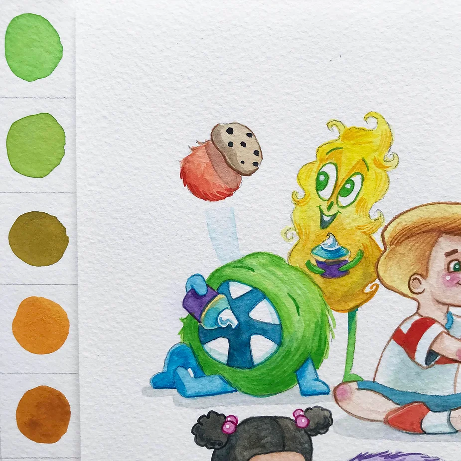
Close up of Baboo sharing with her friends, a painting created using my own palette. Notice how DeeDee’s pants were rendered using a mix of cad yellow and cad orange, while Charlie’s hair is cad yellow and yellow ochre. So fun to see these side by side!
3) Compatibility. Certain colors just don’t mix well. Think of the pigment catalogue as a list of wedding guests who need to be seated with care. Some will dance the night away together while others will end up in a fistfight in the bathroom if not carefully monitored. A well curated palette will blend gracefully no matter where you seat them.
4) Fluency. I have a steep learning curve and the more I can limit my palette the faster I will be able to get my head wrapped around it. When I think “Oooh a blue violet would look great here”, I’ve decided ahead of time whether to use ultramarine blue or a mix of phthalo blue with quinacridone magenta. Also when I’m matching against other mediums like colored pencil or even against pigments from different brands I know what particular nuances I’m looking for according to the qualities of my palette.
So here it is! I built this palette around a few of my favs: cadmium yellow light, phthalo blue, viridian green, cadmium red light, dioxazine purple and Payne’s grey as mixed in the Golden Qor line. For the most part those are strong, vibrant colors so I filled in the gaps with complimentary neutrals. This particular palette is quite bright and vivid. I’m able to keep my colors clear in light and dark value situations which I prize. I plan to try out a new palette in a year or so but for now am so happy to have a set of colors that I can use to quickly bust out new works of art and advance my technical skills.

Close up of my new watercolor palette. I love how deep or light these colors can go, depending on how you push them.

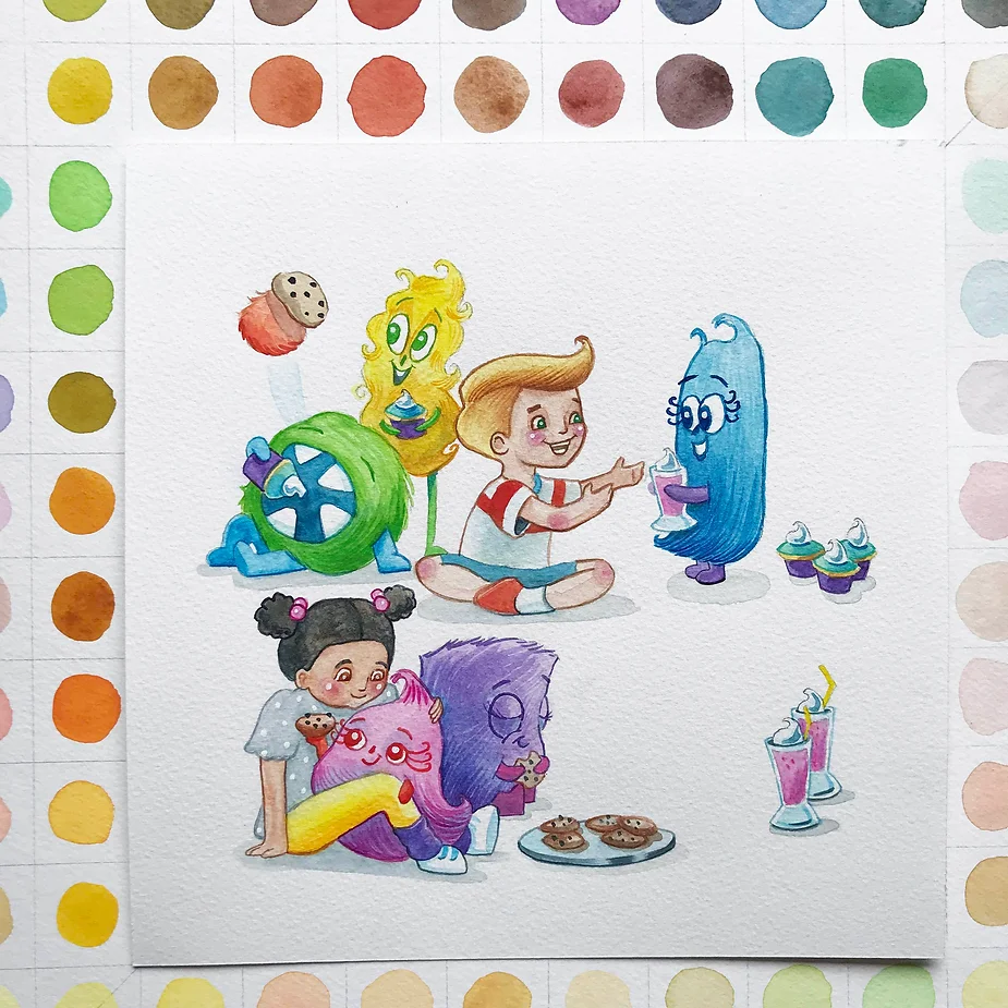
Here’s a painting of Baboo and her friends, painted using my new palette.

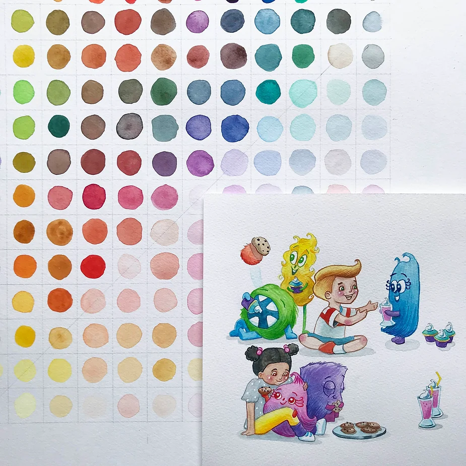
My entire palette and one of it’s first creations! Grabble (the one gnoshing on a cupcake) is painted with viridian green and cad yellow. That was actually the color mixture that inspired this entire palette.

